Data Visualisation is a powerful tool for analysing your business data, harnessing the brain’s ability to recognize patterns and shapes. The latest powerful tools enable diagrams, charts and graphics to be created on the web with a speed and interactivity that was unthinkable even five or six years ago. Add to this the ability to draw in the browser in three dimensions and even with virtual reality, then the possibilities are very exciting.
In this article we feature some of the latest examples of Data Visualisation and give you an insight into the tools used to produce them.
Uber Engineering Team
Technology: React, MapboxGL
Uber handles billions of data points every day, and has grown it’s own in-house data visualisation team to make the best use of that data resource. Combining this nab-based data gives city managers and ops teams a real-time visual overview of supply and demand distribution.
Read more >
UK Road Accidents
Technology: Mapbox, deck.gl
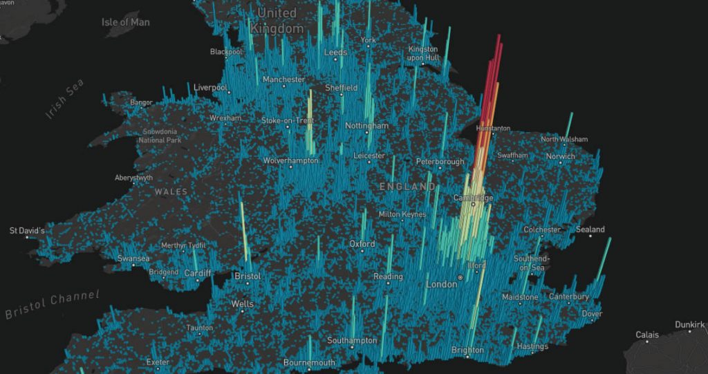
Not the most cheery of subjects, but this demo by Ryan Baumann of Mapbox is a great example of combining mapping with a large dataset to give real, useful, location-based visuals. Using hexagonal mapping and coupled with an interactive UI enables the density of accidents to be mapped very smoothly and informatively.
Read more >
Launch It
Technology: WebGL, PixiJS
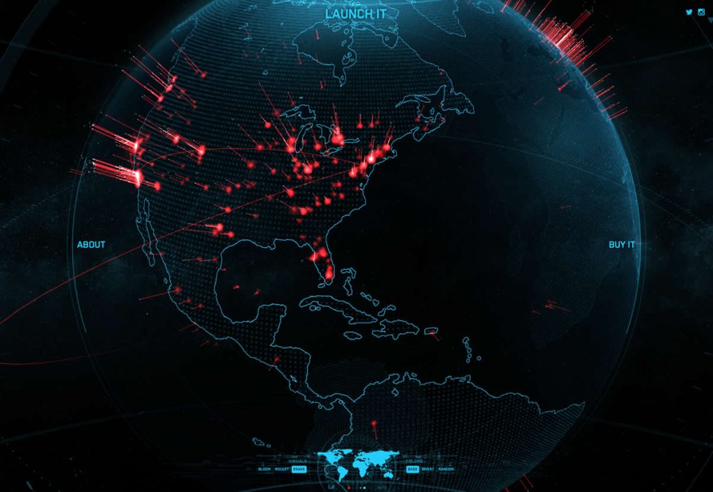
It’s worth waiting for the loading messages to clear, as this fantastic interactive spinning world is one of best designed and implemented of it’s type. Produced by designer Shane Mielke was made to support the Launch It book release, giving feedback on where the book can be bought.
Read more >